An inexact match can be exactly right!

Exact or inexact?

Firstly, let us be clear about the difference between exact and inexact matches.

Exact matches

Normally when you are doing a lookup using MATCH, XLOOKUP or VLOOKUP, you want to find an exact match in your look up table. For example, you want the cash discount percent for a specific customer. When you look up the customer account number in your lookup table, you want to find the result for the specific customer and not for another customer which happens to have a similar account number.

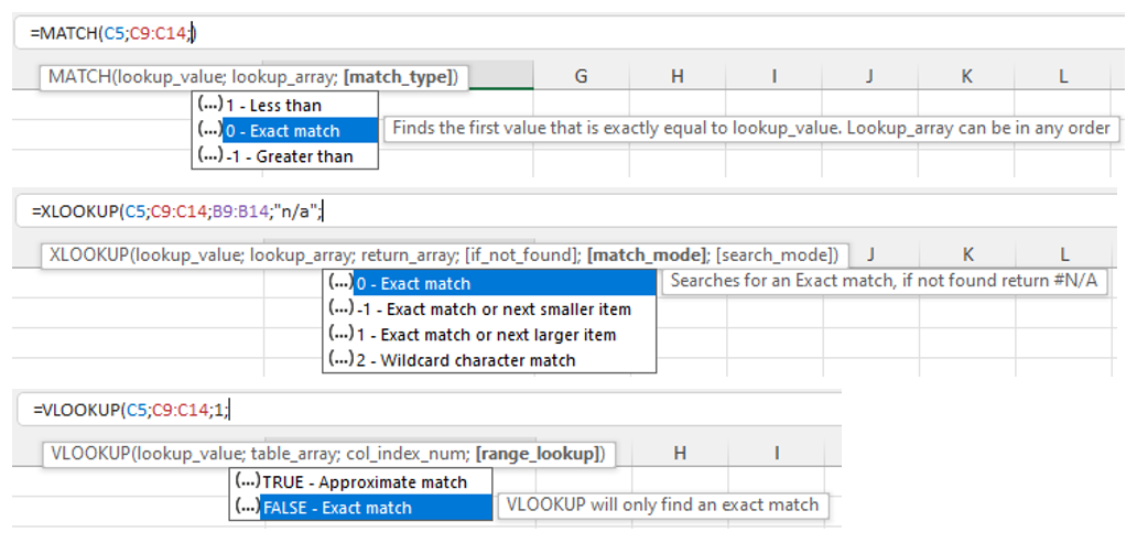
In such cases you need to use the optional argument of 0 for MATCH and XLOOKUP or FALSE for VLOOKUP. The lookup table data can be in any order, Excel keeps looking until it finds the first match, or reports an error if it cannot find the searched item at all.


Inexact matches

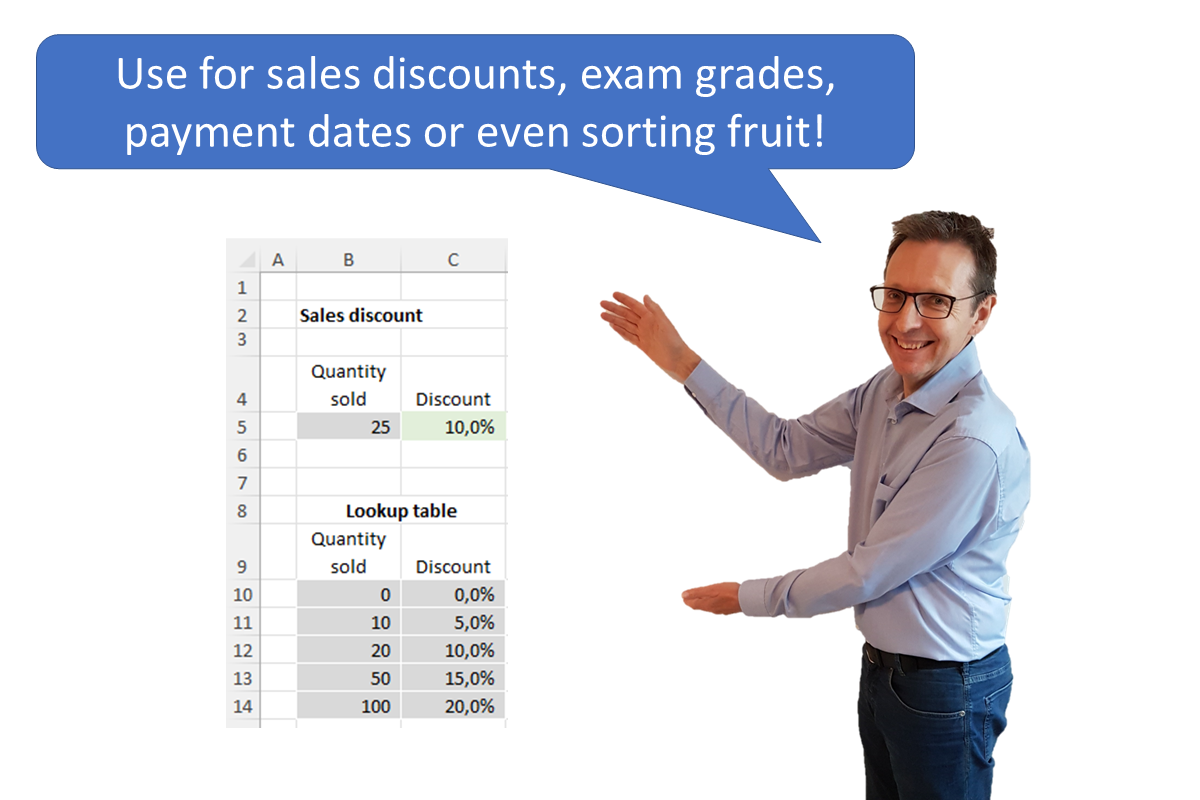
In some cases, however, it may be necessary to use an inexact match if the item you are looking for may not be exactly found in the lookup table, for example a list of sales discounts based upon the quantity sold (see example 1 below).

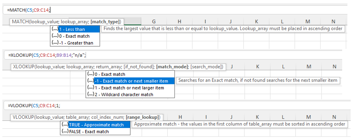
In such cases you need to use the optional argument of 1 or -1 for MATCH and XLOOKUP or TRUE for VLOOKUP. The lookup table data must then be in ascending or descending order, per the tooltip shown (note that VLOOKUP can only cope with lookup data in ascending order). Excel then searches until it either finds an exact match or returns the result that is “not too far”. This is best illustrated with some examples.

In all four examples there is an input cell (grey background) and an output cell (green background). The output cell uses the powerful combination of the INDEX and MATCH functions to get the correct result from the lookup table using an inexact match. You could use XLOOKUP instead (or possibly even VLOOKUP but I do not recommend this function as it has a number of weaknesses and risks).

You can download the Excel file with all four examples here: Inexact match download

  1. Sales discount
  • Task: Input the quantity sold to get the discount percent.

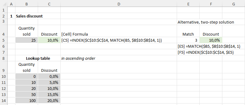
  • Solution: We need to find the largest “quantity sold” in the lookup table which is less than or equal to the input quantity to get the corresponding discount percent. We therefore use the inexact match argument 1.
  • Lookup table: This requires that the look up table is sorted in ascending order.


  1. Exam grade
  • Task: Input the exam result in percent to get the exam grade.

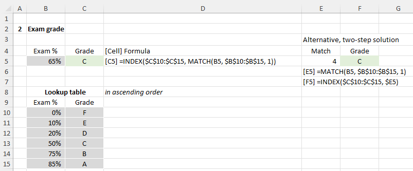
  • Solution: Similar to case 1. The inexact match argument is also 1
  • Lookup table: Per case 1, sorted in ascending order.


  1. Payment date
  • Task: Input the invoice due date to get the next payment date.
    This can be very useful for cash planning tools: use an accounts payable report to generate payment dates.

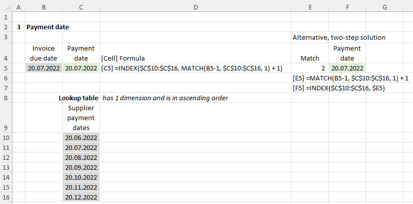
  • Solution: If the lookup table is in descending order, the solution is relatively straight forward, but in reality a list of dates will probably be in ascending order. This makes the solution a little trickier but with a bit of testing you can find the correct approach.
    > Search date: We must deduct 1 from the input due date in order to also get the correct result when the input date exactly matches a payment date, otherwise we will get the following payment date.
    > MATCH finds us the largest (i.e. latest) payment date which is less than or equal to the search date, i.e. it gives us the prior payment date. We must therefore add one to the MATCH result to get the next payment date.
  • Lookup table: The lookup table is sorted in ascending order (because that is probably how it will be) but has only one dimension. The formula searches for the invoice due date (input) in the list of payment dates and returns the next payment date from the same column.
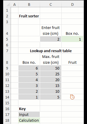
 

  1. Fruit sorter
  • Task: Lastly for a bit of fun we have a fruit sorter 😊
    Input the fruit size in centimetres to find the smallest box that is big enough to hold it.

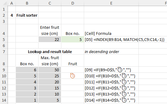
  • Solution: Because we are looking for the smallest box that is greater than or equal to the fruit size we need to use the inexact match argument -1.
  • Lookup table: In this case, the lookup table must be sorted in descending order. There is an extra column here to clearly show the box in which the fruit ends up. This is determined using a simple IF formula with a fruit symbol… this is an emoji selected using the Windows key and . and then typing fruit to see a selection of fruit symbols. After my selection, I changed the text colour of the "Fruit" column to a dark orange.
  • And action! Here's the solution in action...


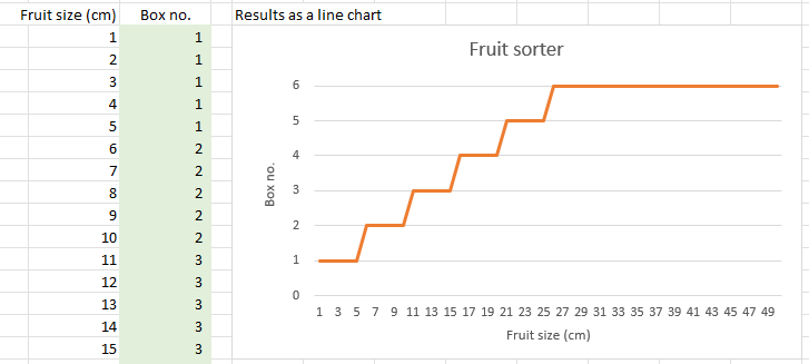
You want more results?

These approaches are not restricted to a single output cell but can be used in a large table of calculations with results calculated for each row, as shown below for the fruit sorter with a chart of results for analysis.


I hope this blog helps you in your work!


More help

For more explanations please see my videos on INDEX and MATCH or XLOOKUP,  Here you will also learn the problems and risks associated with VLOOKUP.

Use a BASE corkscrew to plan fixed assets and loans

In a financial model you need to plan balance sheet positions. There are various techniques to do this, and the most suitable technique depends upon the balance sheet position. For fixed assets and loans, a BASE corkscrew can be ideal.

BASE stands for

  • Beginning balance = End balance of prior period
  • + Additions
  • - Subtractions
  • = End balance

For fixed assets, the additions represent CapEx, and the subtractions represent depreciation. Subtractions could also represent sales of assets but as a general rule, we do not plan to dispose of assets, but simply replace them (CapEx) as they become fully depreciated.

For loans, the additions represent loan drawdowns, and the subtractions represent loan repayments. Note that interest does not affect the loan balance (unless you do not pay the interest but add it to the loan balance, a so-called PIK loan = payment in kind). The interest is a cost which flows into the P&L.

So what does a BASE calculation look like in Excel and why is it called a corkscrew?

The screenshot shows an example for fixed assets. I selected the closing balance figure for the first year and used the “Trace Dependents” button repeatedly (this can be found on the Formulas ribbon under “Formulas Auditing”). The zigzag corkscrew effect of the data flows is clearly visible.

Easy-to-enter sheet and file name formulas

Here’s a great trick using autocorrect to easily enter a formula to show the name of the sheet or file. Set up once, use as often as you want with a simple two-letter entry.

I use these formulas a lot e.g., to create a flexible template sheet for my Excel models. When I copy the template and rename it, the sheet name (say in cell A1) automatically updates… fantastic!

How to set up
Here’s how to set it up for sheet name (a one-off exercise)...

  1. Copy this formula if you have commas as separators
    =MID(@CELL("filename",A1),FIND("]",@CELL("filename",A1))+1,256)
    or this one if you have semi-colons as separators
    =MID(@CELL("filename";A1);FIND("]";@CELL("filename";A1))+1;256)

  2. Go to File, Options, Proofing, AutoCorrect Options…


  3. Under “Replace:” enter SN (for sheet name) and under “With:” paste the formula you copied in step 1, then “Add” and “OK” twice.

To set up the filename formula follow the same steps but replace FN (for file name) with this formula if you have comma separators
=MID(@CELL("filename",A1),FIND("[",@CELL("filename",A1))+1,FIND(".xls",@CELL("filename",A1))-(FIND("[",@CELL("filename",A1))+1))

or this one if you have semi-colon separators
=MID(@CELL("filename";A1);FIND("[";@CELL("filename";A1))+1;FIND(".xls";@CELL("filename";A1))-(FIND("[";@CELL("filename";A1))+1))

How to use

Simply go to a blank cell, type SN (space) and enter and you have your formula for sheet name!

Or type FN (space) and enter and you have your formula for file name!

(Technical tip: these formulas use the CELL function which only works if you have saved your file, because only then does it have a full path name).

Have fun with them!

Bar chart with values above/below minimum

You have, say, plan bank balances for different scenarios and also a minimum or target value.

Wouldn’t it be great, if you could show these clearly in a chart and the bar colours would automatically change, depending upon whether the scenario value was above or below the minimum?

Well, you can! I will now show you how, step-by-step.

1. Set up your data with two extra rows

  • Have scenario values in one row and the minimum values in another

  • Two extra rows should show values (i) equal to or above the minimum and (ii) below the minimum. We will show these as two separate series in the chart, so that we can give them different colours


    2. Create your chart
  • Insert a stacked bar chart (not a clustered bar chart)


  • Right-click in the chart and choose “Select Data…”

  • For the Legend Entries (Series) select or add the three series: Above minimum, Below minimum and Minimum


  • For the horizontal-axis values add e.g. the scenario names

    3. Format your chart bars and line
  • Right-click on a bar for the “Minimum” series and choose “Change series chart type…”

  • For the series Minimum select “Line”


  • Right-click on a bar for the series “Above minimum” and select “Format data series…” or left click and use the shortcut Ctrl 1

  • Change the colour e.g. to light green

  • Do the same for the series “Below minimum” and change the colour e.g. to pale red

  • Do the same for the line series “Minimum” and change the line colour e.g. to dark red and maybe make it a dotted line


4. Add and format data labels

  • Right-click on each of the three series in turn and select “Add data labels”

  • To avoid zeros appearing for “Above minimum” when the value is below minimum (and vice versa) format the data label numbers so that zeros do not appear: right-click on a data label and select “Format data labels…” or left click and use the shortcut Ctrl 1. Enter the custom format #,##0_(;(#,##0); if your thousand separators are commas or #.##0_(;(#.##0); if they are dots and click “Add”. This format has three components: positive numbers; negative numbers; zero (blank)

  • Finally you can select individual data labels for the series “Minimum” and delete all but the last one, which you can format to show to the right


5. Add chart title and tidy up the legend

  • Add a clear chart title include units (e.g. EURk)

  • Select and delete the legends for “Above minimum” and “Below minimum” as the chart title is clear enough


Et voilá… your great chart is complete!

If you want, you can save your chart as a template and use it again.


For general tips on the best chart type to use, see my best chart blog.

All models are wrong, but some are useful

This quote is from a paper by British statistician George E. P. Box published in 1976 called “Science and Statistics”. Although primarily made in reference to the fields of statistics and analytical models, it can also be applied to financial and other models created in spreadsheets.

A model is a simplified representation of reality. The act of simplification means that all models are wrong because they do not reflect all elements of reality. To have complete accuracy would require e.g., a map on the scale of 1:1. This may well be accurate, but it would not be useful as you could not do any sensible route planning with it – it would be simply far too big and unwieldy.

On the other hand, if we accept a loss of some accuracy, we can have a model which is “wrong” but useful. In physics, for example, the Bohr model of the atom is “wrong” but can nevertheless be very useful in predicting and explaining events in the real world.

The same principle can be applied to spreadsheet models. The key is finding the “sweet spot of usefulness” between accuracy and complexity on the one hand and simplicity and ease of use on the other.

This is not always easy but, as with most skills, you can get better with experience.

Here is my advice to help you:

1.

Think about the level of detail you need in your model before you start work on it.

If appropriate, discuss with colleagues, model sponsors or users before starting.

Always bear in mind:

(i) the model purpose – what content and functionality is relevant and useful?

(ii) the users – what functionality will they understand and be able to use reliably and efficiently (possibly after training)?

2.

Focus on the essentials and use the 80:20 rule.

Often, 80% of the results can be explained by the 20% most significant factors, so focus on these. Minor costs (for example) should not be planned individually but in aggregate as part of an “Other costs” position.

If appropriate, focus on the top 10% of factors first to get a working model up and running which can be used for early decision-making and expanded later.

3.

Before adding more complexity, think about how significant the effects could be on results or usability.

If the increase in complexity would bring only a minimal increase in accuracy or functionality, then maybe you should not make the change. Or perhaps a simplified version would suffice.

For example, planning sales at individual product level may be too detailed. Planning at brand or business area level may be more suitable.

Once you have made your decisions, be ready and able to explain them.


I will conclude with another quote from George Box which summarises the situation very well.

“All models are approximations. Assumptions, whether implied or clearly stated, are never exactly true. … So, the question you need to ask is not "Is the model true?" (it never is) but "Is the model good enough for this particular application?"