Excel offers a huge variety of charts (also commonly called graphs) so it can be difficult to identify the most suitable type for presenting your data. Here I explain some basic guidelines which should help you pick the best type in several typical cases and some useful tips. I also give some advice on which chart types are not recommended.
What’s on offer?
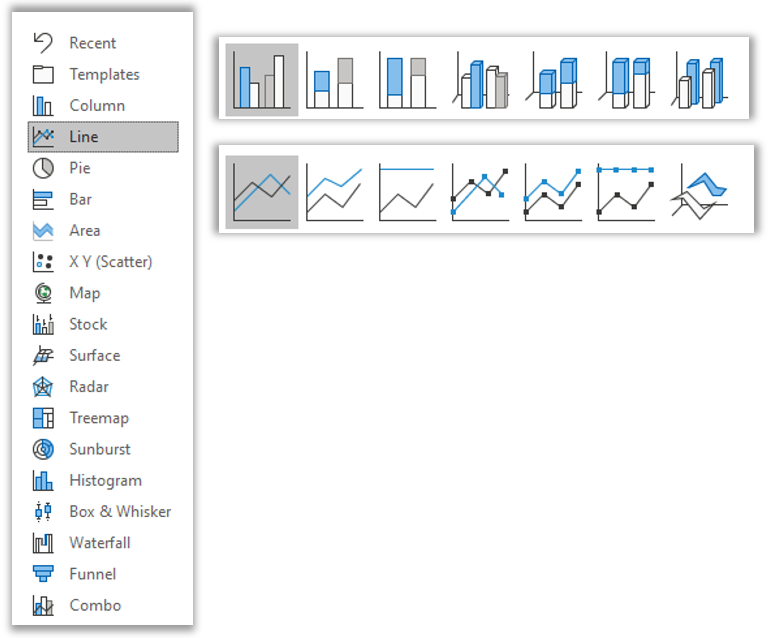
At the time of writing, Excel 365 offers 17 different chart types, shown below. Each type has several sub-types, shown below for column (bar chart) and line chart. You can also mix and match different types in a single chart, now called “Combo”. That means a lot of choice.

Does Excel offer any help?

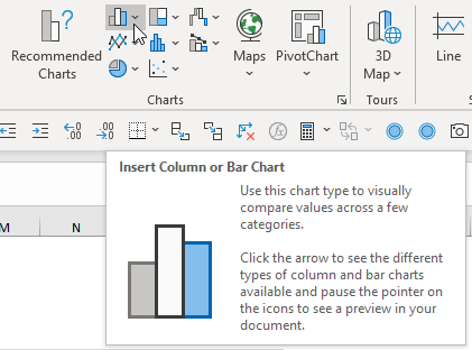
Yes - when you select data and move to Insert, Charts, Excel offers some recommended charts which you can review.

If you hover over a chart icon, Excel shows you a large tip box with guidance.
I don’t always agree with the recommended chart types or the tips given, however, so I prefer to select my own using the following principles.
What type of data do you have?
I have reviewed the charts in numerous spreadsheets and found that in over 90% of cases these fall into one of the following three categories, so I will focus on these.
- Data over time
- Data per category
- Change in a single value over time or between e.g. plan and actual
1. Data over time
E.g. Sales per year or number of kilometres travelled per month
--> In this case I recommend a line chart as it is easier to see trends over time.

In the two charts above I have plotted the same data as both a line chart and a clustered bar chart. The line chart shows more clearly show that business A is a rising star, B is plodding along, and C is a falling star. In the clustered bar chart, this development is more difficult to see. In my opinion, this is more important than comparing businesses within each year, which is what the clustered bar chart enables you to do.
2. Data per category
E.g. number of customers per region or average amount spent in a month on various leisure time activities (such as going to the cinema) in different countries.
--> In this case I recommend a clustered or stacked bar chart to facilitate comparisons. There are several options, which I now compare.

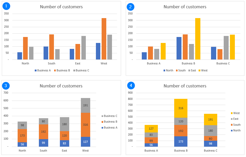
In the four charts above I have plotted the same data as clustered charts (1 and 2) and as stacked bar charts (3 and 4).
- Charts 1 and 3 are better to analyse the regions:
(1) Here you can compare the businesses within each region
(3) Here you can better compare regions against each other
- Charts 2 and 4 are better to analyse the businesses:
(2) Here you can compare the regions within each business
(4) Here you can better compare businesses against each other
- Ask yourself which chart version best presents the data for the analysis you are performing.
How2tips:
- In charts 3 and 4, I have added data labels as it is no longer easy to judge the size of each bar component; to do this, right-click on a coloured bar and select “Add data labels”; repeat for all other colours. Light coloured labels are better on dark backgrounds and vice-versa. To format labels, simply left-click on a label to select the series and then use the usual text formatting icons in the Home ribbon or right-click on a label and select format data labels.
- In charts 3 and 4, I have also moved the legend to the right-hand side. This matches the construction of the bars (e.g. in chart 4, from North at the bottom to West at the top) and so makes it easier to read what each colour in the bar represents. To do this, right-click on the legend, select "format legend" and then select legend position "right".
- In charts 1 and 2, it is better to have the legend at the bottom for similar reasons.
- You can change the chart type by right-clicking on the chart and selecting the aptly named “Change chart type.”
If some of your data is not split into discrete categories such as business regions but can instead take a wide range of values such as price or age, then you display your data grouped into clusters in a histogram. Examples here could be total sales of wine in different price categories or ice cream consumption per age group. A histogram is similar to a bar chart but each bar represents a given range of values such as wine priced up to €5 per bottle, €5 to €10 per bottle etc.
3. Change in a single value over time or between e.g. plan and actual

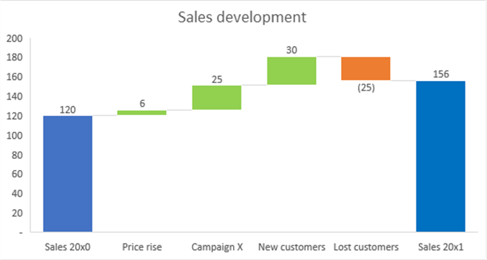
If you want to show how a certain value (typically sales or profit) changed from one year to the next, you can use a waterfall chart to show the changes, as shown above. This chart type is only available as standard from Excel 2016. In older versions, you must create it yourself using stacked bar charts, with some bars having no colour.
Assuming you have Excel 2016 or later…
- Set up your data with the starting and end values and the changes between them with a suitable short description in each case.
- Select your data, then go to Insert, Charts, Waterfall
- Select the first bar by clicking it (so only the first bar is selected) and in the "Format data point” dialog that appears select “Set as total”
- Repeat for the final bar
- Optionally select and change the colour of other bars if you don’t like the defaults
Conclusion: This chart type can be very useful, but it is not as flexible as other chart types e.g., changing the colours is not easy.
More details: see Microsoft or xelplus (Leila Gharani)
What if I have other data types or the line and bar charts don’t help me to tell my story?
- Here you should think about what you want to convey and try out different chart types to see which best does the job.
How2tips:
- If you are not convinced with one chart type, you can change the chart type, as noted above.
- Alternatively, you can copy and paste the chart and change the chart type of the second version so that you can compare chart types side by side. I did this for the four bar chart examples above.
- Please remember that a simple table may be clearer than a chart, especially an overloaded or unusual chart.
Are any chart types not to be recommended?
- Pie charts – this chart type is well loved but the data can always be presented in a better way, perhaps as a simple statement or table. For example, if you have 60% of people are in favour of X and 40% are against, this simple statement is all you need; a pie chart does not improve understanding.
- 3D – these often make it hard to read the values and the 3D effects distract from the data, which, presented in the best way, should speak for itself without gimmicks.

