STOCKHISTORY function
If you have Office 365 then you can use the function STOCKHISTORY. As the name implies, its main purpose is to enable you to retrieve stock prices, but it can also be used to retrieve historical exchange rates. This can be very useful e.g., for converting historical transactions to the reporting currency or assessing the volatility of foreign currency cash flows.
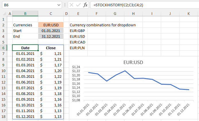
Exchange rates

In the screenshot you can see an example formula in cell B6. The arguments for the function (the bits inside the brackets) must include two ISO currency codes separated by a colon and a date range (dates from and to). Optionally you can specify the interval (0 = daily, 1 = weekly or 2 = annual) and whether you want opening or closing rates etc.
You only need to enter the formula once! It returns a dynamic array with column headers and as many rows of data as necessary. What is also great is that the values are so-called Formatted Number Values (“FNVs”) which means that Excel automatically formats the values with the correct currency symbol.
Stock prices and data type

You can, of course, also use this great function to get stock price values as the above screenshot showing historical Tesla stock prices demonstrates. The formula is basically the same but here the first input for the function is the stock ticker symbol, here TSLA for Tesla.

You can also define the cell with the ticker symbol as data type stock.

Now when you select the cell, you get an extra box with the option to add extra information such as price, 52 week high and 52 week low.
Data source
The source of all retrieved data is refinitiv, "an LSEG (London Stock Exchange Group) business, [and] one of the world’s largest providers of financial markets data and infrastructure."
More information
You can find out more about this function on the official Microsoft blog.